
Punch line: Q3, 2015 SPX inter- & intra-sector returns were largely tarred with a top-down macro brush. Inter-sector returns plumbed red save utilities and flattish consumer staples. Intra-sector stock returns, save utilities, exhibited a lack of vol-scaled dispersion symptomatic of the macro-driven environment. These are reflected in the charts and tables below.
The following sector-level dispersion analysis illustrates the bloodletting that largely tarred stocks with a top-down macro brush over Q3, 2015:
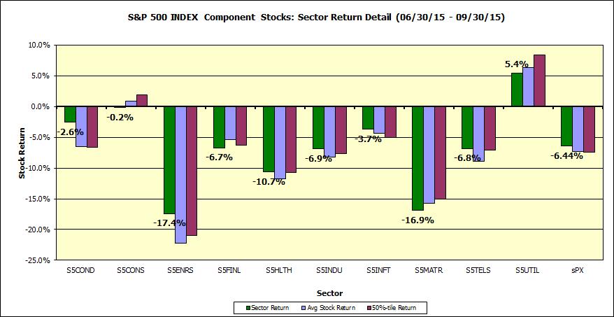
This first chart notes the sector (cap-weighted) return (green bars), average (equally-weighted) return (blue bars) and median stock return (burgundy bars) for the various sector of the SPX over the Q3, 2015 horizon (with dividends, latest constituents). Sector returns, save utilities and flattish consumer staples, plumbed red.
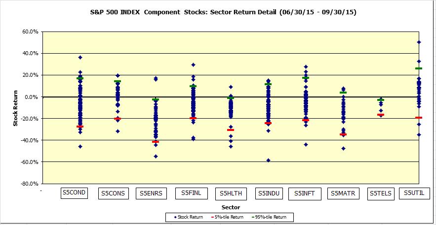
Next, a scatter plot of stock returns by sector, along with 5%- & 95%-tile markers, underscoring the general lack of intra-sector stock dispersion (save in utilities); visually evidenced via the scrunched healthcare dot plot.
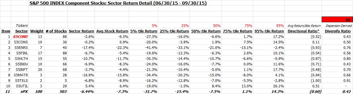
This is also shown in tabular form along with %-tile sector return distribution. Also shown is the directional ratio (avg net return to avg gross return), highlighting returns biased red, save utilities and flattish consumer staples, and dispersion-based diversification ratio which points to the lack of stock-specific vol-scaled dispersion in most sectors.
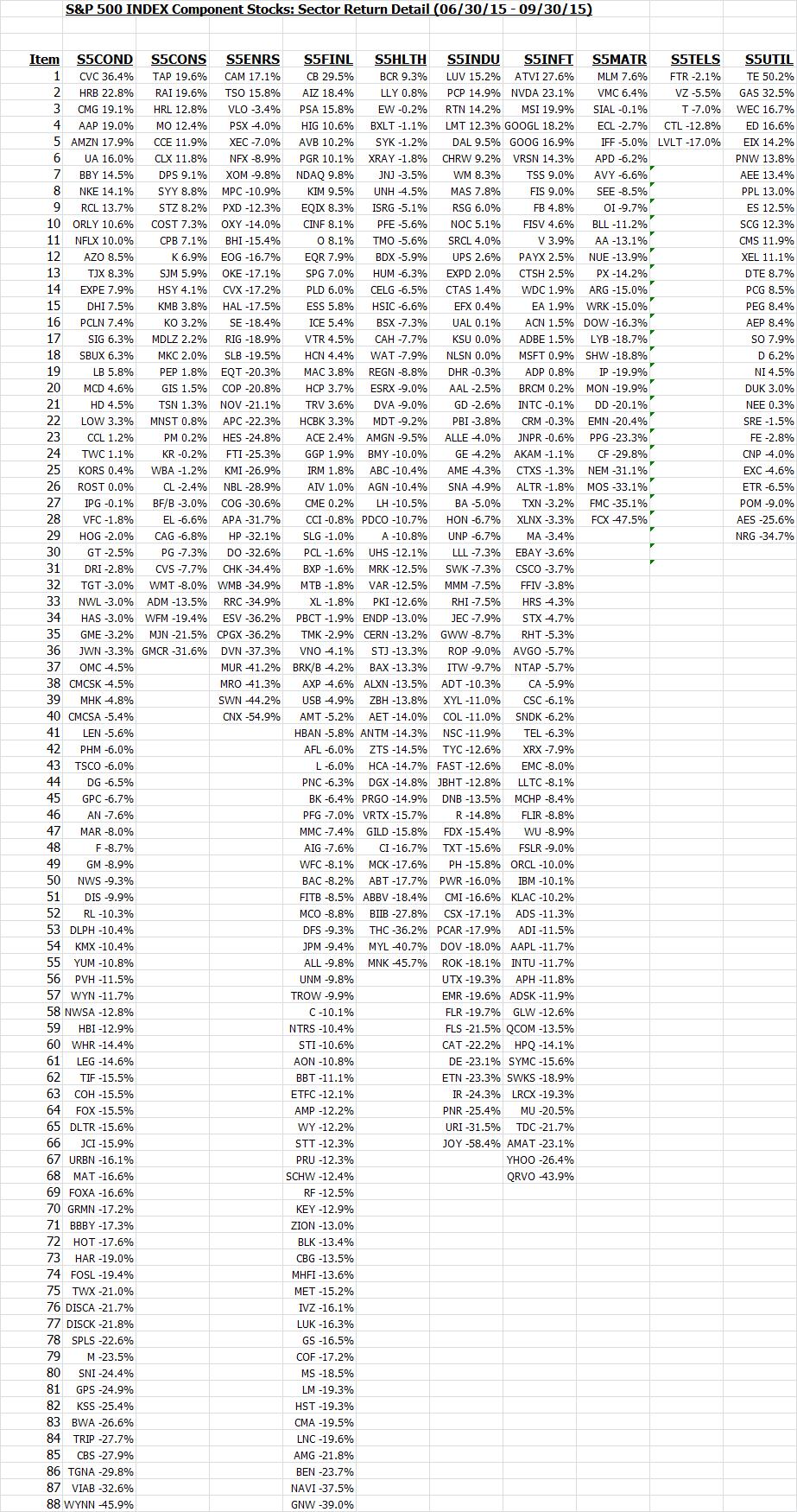
Finally, a listing of stock returns, by sector, ranked in descending order of performance:
Note: calculations Risk Advisors, data Bloomberg
Proprietary and confidential to Risk Advisors