
Punch line: Q1, 2016 SPX sector returns reflect a modicum of inter-sector variability, though mask the intra-quarter see-saw price-action especially at the index level. Sector returns, save financials and healthcare, were all in the green. Intra-sector stock-return dispersion was fairly contained on a vol-scaled basis. These are reflected in the charts and tables below.
The following is an update for the Q1, 2016 sector-level dispersion analysis which reveals a modicum of inter-sector variability, though masks the intra-quarter see-saw price-action especially at the index level.
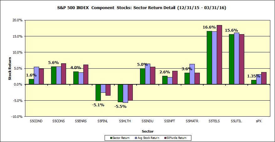
This first chart notes the sector (cap-weighted) return (green bars), average (equally-weighted) return (blue bars) and median stock return (burgundy bars) for the various sector of the SPX over the Q1, 2016 horizon (with dividends, latest constituents). Sector returns, save financials and healthcare, were all in the green. At the index level, and for several sectors, equally-weighted returns bested cap-weighted returns reflecting large-cap underperformance within the SPX space.
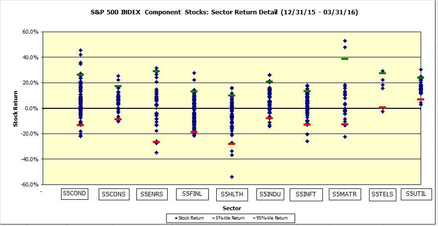
Next, a scatter plot of stock returns by sector, along with 5%- & 95%-tile markers; while visually several sectors sport spaced-out dot plots, on a vol-scaled basis, intra-sector dispersion was fairly contained.
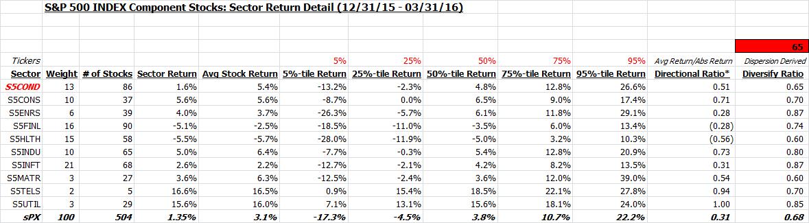
This is also shown in tabular form along with %-tile sector return distribution. Also shown is the directional ratio (avg net return to avg gross return), highlighting sector returns largely biased modestly green, save financials and healthcare, and dispersion-based diversification ratio which points to the macro-tarred higher-correlation behavior present in most sectors and the index.
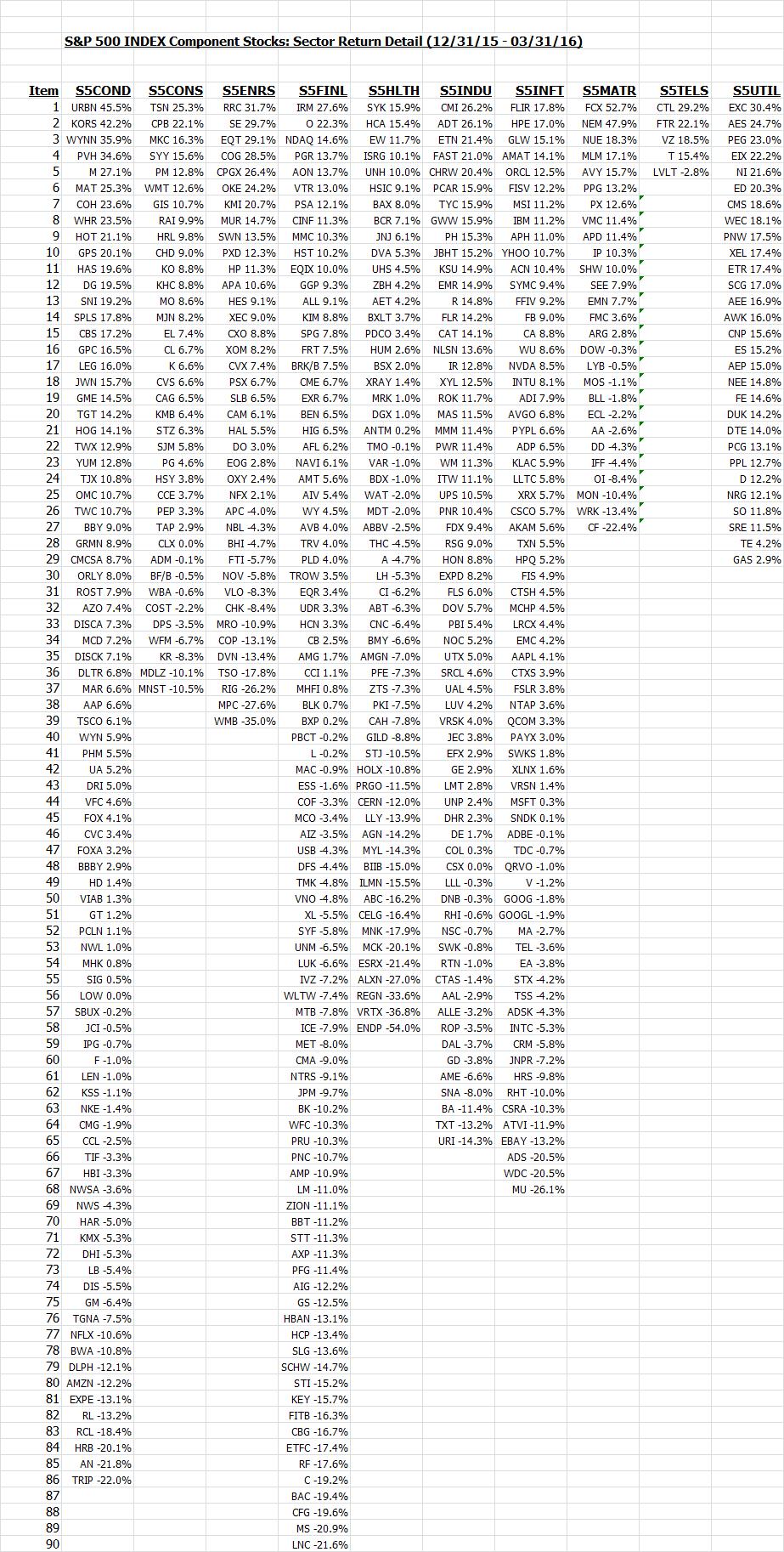
Finally, a listing of stock returns, by sector, ranked in descending order of performance:
Note: calculations Risk Advisors, data Bloomberg
Proprietary and confidential to Risk Advisors