Punch line: global equity returns, led by EM, have, once again, surprised to the upside. However, the pure underlying regional signal, stripping away the correlated return element, is a lot more varied with Europe displaying a flat-to-negative independent impulse.
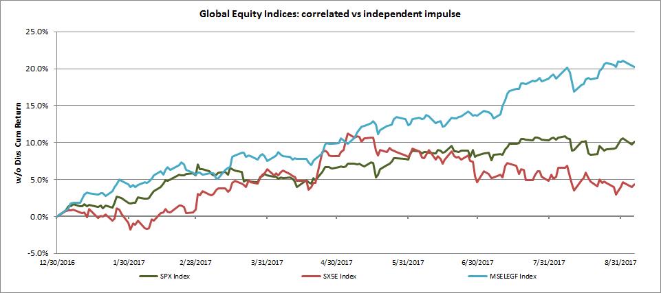
Global equity returns have, once again, surprised to the upside. Bluntly segmenting the globe into US, Europe and EM, the chart below traces the YTD returns for benchmark local-currency indices underlying these geographies. EM (blue) leads the pack at ~ 20%, followed by US (green) at ~ 10% and lagged by Europe (red) at sub 5%.

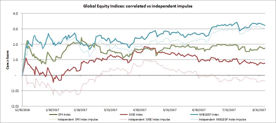
One might expect birds of a risk feather to very broadly flock together, as they directionally do, and as is manifest via their positive return correlation. However, delving deeper, it is instructive to note the signals telegraphed by their independent underlying economic impulse after stripping away the correlated portion of their returns. By sequentially “de-correlating” their return streams **, one is able to tease out the pure independent regional impulse whose underlying signals are far more varied.
This is depicted in the graph below which presents this dynamic in volatility-scaled “z-score” units. The bold lines depict the standard realized z-scores of the US (bold green), Europe (bold red) and EM (bold blue). I then sequentially “de-correlate” the z-scores by stripping away the US impulse, followed by the Europe impulse. This is shown via the faint lines which depict the pure underlying independent impulse: Europe (faint red) has a flat-to-negative underlying independent impulse while EM (faint blue) has a solid positive pure independent impulse. (The US standard and independent z-score are one and the same as the US is modeled as the primary driver variable.)

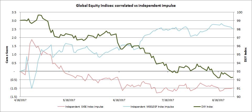
While Europe and EM have unique drivers (growth and inflation, monetary and fiscal policy, internal and external balance etc.) to help explain their divergent independent impulses, lately the currency driver has very broadly coursed an explanatory high-level trend. This is shown in the chart below (May 1,2017 to date), which shows the decline in the US dollar index (“DXY”; bold green line; right y-axis) broadly coinciding with the decline in the independent European impulse (faint red line; left y-axis) thereby potentially reflecting the reduced trade-competitiveness/currency-translation dynamic from a stronger Euro. Conversely, a weaker DXY reduces capital-flight risk from EM and boosts the independent EM impulse (faint blue line; left y-axis) driven by favorable EM macro fundamentals.

** via inverting the Cholesky decomposition lower-triangular matrix to glean uncorrelated z-scores from their correlated brethren.
Note: calculations Risk Advisors, data Bloomberg
Proprietary and confidential to Risk Advisors
