
Punch line: with the Fed in the midst of a rate-hike cycle coupled with perplexingly quiescent long yields, à la 2004-06, the elusive term premium is back in vogue. The following analysis presents a practitioner’s estimate of the term premium, documents its recent evolution and contrasts it with the “ACM” construct.
The term premium is an unobservable, amorphous metric that has garnered an increasing amount of attention and sophisticated analysis ever since Greenspan’s bond “conundrum” and Bernanke’s “savings-glut” labels captured the collective imagination of policy makers, market participants et al.
Now, with the Fed in the midst of a rate-hike cycle coupled with perplexingly quiescent long yields, leading to chatter of an imminent curve inversion (gravitational pull of lower overseas yields abetting), term-premium dynamics have once again become front and center.
Given the potential for non-trivial measurement error in the estimation of the term premium, and in the spirit of being broadly illustrative rather than surgically precise, I took a step back to create a common-sense, practitioner’s estimate of the 10-year term premium, dubbed “unsophisticated term premium,” henceforth “uTP;” the end results of which are reflected in the chart below:
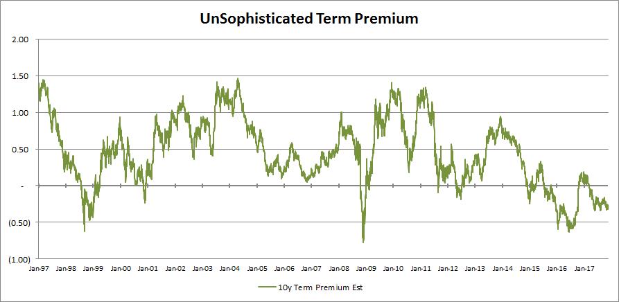
A few observations:
- the uTP pierced -50bp on a handful of occasions, following which it bounced back fairly forcefully. This presented a propitious opportunity to short, or underweight, 10-year treasuries. To cherry pick the most recent occurrence, the uTP was below -60bps in early July, 2016, with the 10-year yield sub 1.4%. Towards year-end 2016, the uTP climbed to the high teens, with 10-year yields above 2.5%.
- the virtually monotonic decline in the uTP from ~ 150bp in mid-2004 to ~ 10bps in late 2005, proximately coinciding with the 2004-06 rate-hike cycle, heralded the head-scratching labels referenced in the introduction.
- over the mid-term past five years, the uTP recorded a local high shy of 100bps at year-end 2013, with 10-year yields ~ 3%, which defined the upper barrier of the mid-term trading range for 10-year yields.
Armed with an estimate of the term premium (green line), one can infer the 10-year average expected short rate (red line) discounted in the nominal 10-year yield (blue line), as reflected in the graph below:
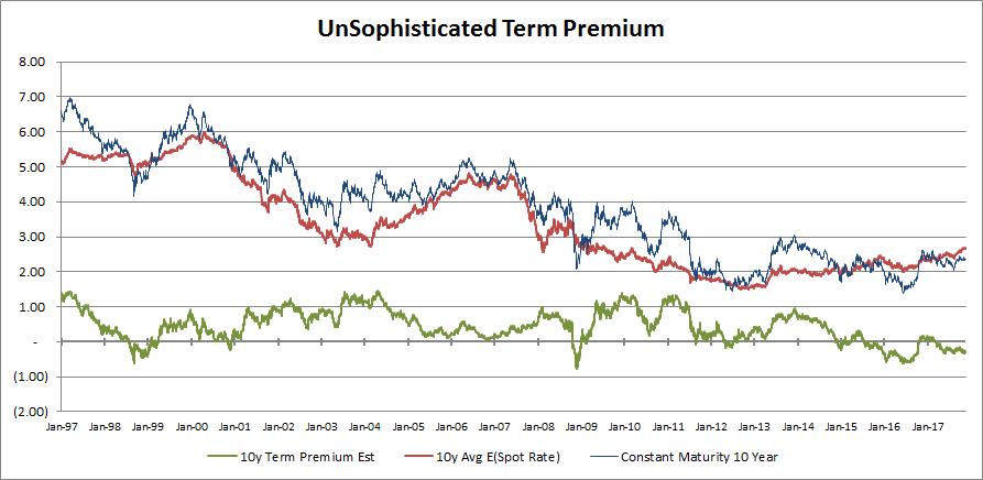
A few observations:
- as is visually apparent and one might expect, the 10y average expected short rate is distinctly less volatile than nominal 10-year yields, with the volatility in the term premium making up the difference.
- post the tech bubble of 2000 and pre the GFC, the 10y average expected short rate largely traversed a 3%-5% range, perhaps on average conforming to the old rule of thumb of an equilibrium short rate of 4% (2% real + 2% inflation).
- over the previously referenced 2004-06 rate-hike episode, the substantial decline in the uTP contributed to lower nominal 10-year yields; the 10-year average expected short rate increased over this horizon, as one might expect given the hike cycle, thereby arresting the decline in nominal 10-year yields.
- over the mid-term past five years, the 10y average expected short rate has been exceedingly moribund, moving glacially from a low of ~ 1.5% in early 2013 to a high of ~ 2.7% most recently.
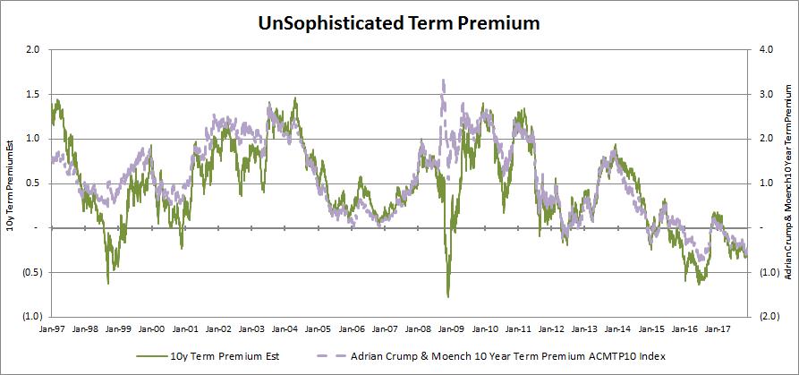
Dueling term premiums:
Adrian, Crump & Moench term premium (“ACM”) typically serves as the market’s term-premium barometer of choice. As shown in the chart below, uTP (green line; left y-axis) is generally well correlated with ACM (purple line; right y-axis). Encouragingly, uTP is less volatile than ACM (the right y-axis is double-wide relative to the left y-axis) and didn’t go as haywire as ACM during the GFC (the flight-to-quality bid depressed the term premium per uTP, whereas ACM unintuitively soared).
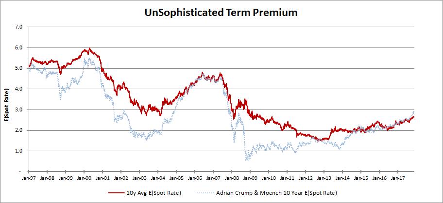
This is also manifest via the implied 10-year average expected short rate via the uTP methodology (red line) which commonsensically has more gravity and less instability than the 10-year average expected short rate via the ACM construct (dotted blue line), as reflected in the graph below:
Unsophisticated term-premium (uTP) methodology:
The underlying principle was to create two investment schemes: investing in the risk-free short rate or investing in a longer-maturity instrument and liquidating it early. Since the latter scheme yields an uncertain return, a risk-averse investor would demand an incremental risk premium, or excess return, to compensate him for the unpredictability. This excess return, which incorporates the premium for assuming both inflation- and real-rate risk, is the term premium for embracing duration risk. The term premium is not directly observable and is finessed by computing the realized excess return of the risky strategy and using that as an unbiased estimator of the term premium.
I compute the uTP by taking the bp-equivalent of the realized excess return and regressing it on coincident common-sense explanatory factors. The regression coefficients are all statistically significant and have the right signs. The explanatory variables used are:
- yield level: higher yields are preferable to lower yields, all other things being equal
- yield-curve slope: a steep slope facilitates rolling down the yield curve
- expected inflation: higher expected inflation should require incremental return compensation
- volatility of expected inflation: the same for greater expected inflation variability
Finally, I list the uTP decomposition for a few pertinent dates referenced in the analysis above:
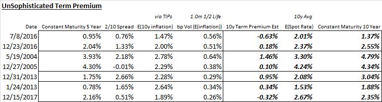
Note: calculations Risk Advisors, data Bloomberg
Proprietary and confidential to Risk Advisors