Punch line: the halcyon days of risk-parity alchemy saw both stock and bond prices trend upwards over time, while their negatively correlated ST returns provided a risk-reducing diversification benefit; manna from heaven!
Financial prognosticators will often reference charts where two indices visually appear to tread the same path and site that as evidence of positive correlation and cohabitation (and further posit inferences based on any divergence). Indeed, the correlation between the index level may indeed be positive, appearing to vindicate their co-association claim.
However, dig deeper into the contemporaneous change in the index level, or index return, and the correlation may be far more muted, or even flip signs.
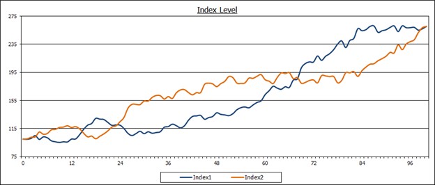
The following stylized charts illustrate this dynamic. In the first chart on index level, the two indices traverse up the northeast quadrant, concomitantly increasing in value through time. Indeed, their correlation on index level is +0.8.

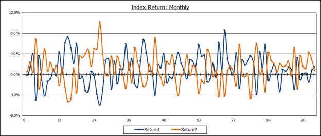
In the second chart using index return, their index returns are diametrically offsetting through time; the correlation on index return is -0.9!

What gives? Both indices have positive trend drift causing their index level to rise over the LT. However, volatility around their trend drift is negatively correlated causing one ST return to zig whilst the other zags. (Return cumulates with time, while volatility tends to expand with the square root of time.)
This is not a theoretical abstraction. The halcyon days of risk-parity alchemy saw both stock and bond prices trend upwards over time, while their negatively correlated ST returns provided a risk-reducing diversification benefit; manna from heaven!
In summation, caveat emptor: choose your correlation wisely depending on the purpose at hand.
Note: calculations Risk Advisors
Proprietary and confidential to Risk Advisors
