Punch line: the malevolent trifecta of lower equities, higher rates and a weaker US$, while infrequent, is particularly noxious. Gold, more up than down during these episodes, is buttressed higher by a weaker US$ and buffeted lower by higher rates.
Earlier this year investors were faced with the unholy trinity of lower equities, higher rates and a weaker US$. Whether this inglorious bullet’s been dodged or deferred remains to be seen; nonetheless, episodes of broad, macro disenchantment of all things US, while infrequent, are particularly pernicious and warrant a closer examination.
While fiscal stimulus, monetary tightening and reinvestment tapering have fomented higher rates, the US$ which normally would strengthen based on improving rate differentials, nominal and real, has instead weakened, latest fillip notwithstanding, given the offsetting impulse from synchronized global growth and the strident rhetoric surrounding trade protectionism.
Additionally, equities and rates have largely been in a risk-premium/growth-flavored regime, moving up/down in tandem, since the new millennium. Recently, with the Fed back in play and inflation creeping up to target, the duration/policy regime where equities trade inversely with rates, as traditional long-duration assets, has engendered lower equities and higher rates (refer: S&P 500-UST 10y relationship).
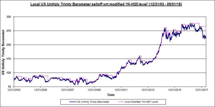
To study this ignominious trifecta, I created an “unholy-trinity” barometer (1/1/2004 to date) that declines when equities (S&P 500) fall, rates (UST10y yield) rise and/or US$ (DXY) weakens, each on a volatility-adjusted basis. This is depicted in the chart below:

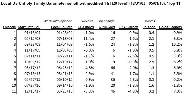
Next, I harvested significant draw-down episodes, subject to a modified high-water mark, from the above chart. Further, I only selected episodes where equities fell, rates rose and the US$ declined (blacking out 9/1/08-3/31/09 eye of the GFC storm); this yielded 11 extreme joint episodes, shown below:

It should be noted that gold, more up than down during these episodes, is buttressed higher by a weaker US$ and buffeted lower by higher rates.
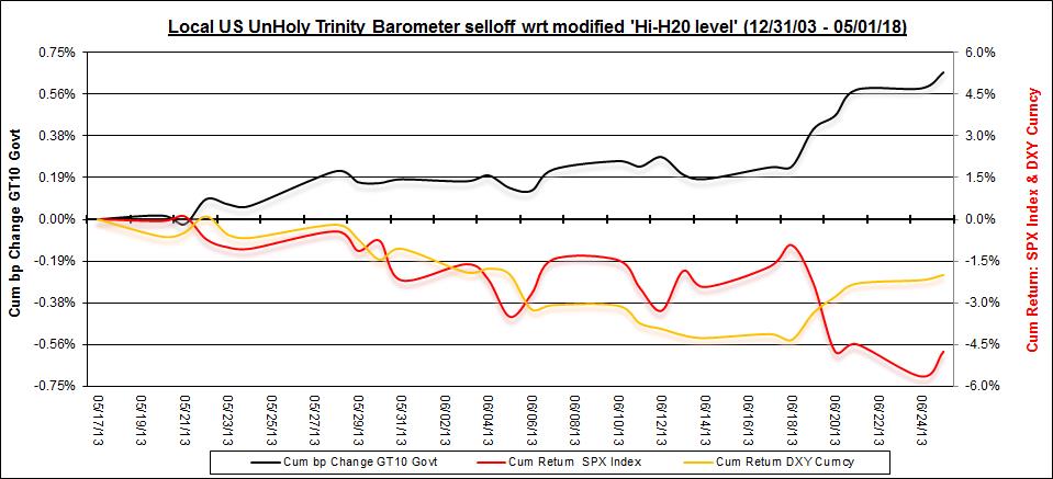
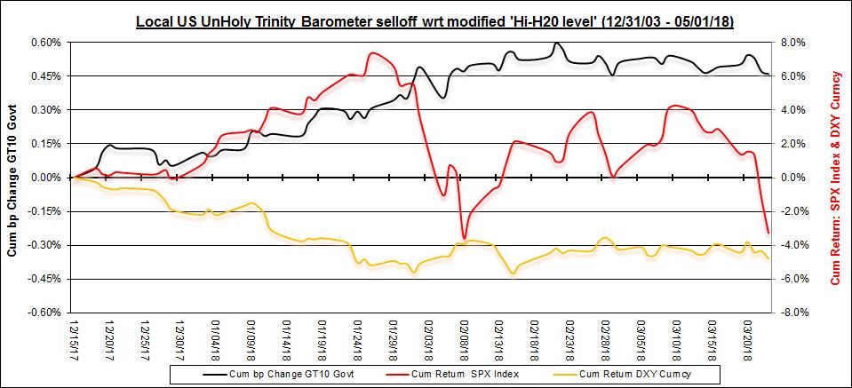
The next two charts reflect the time-series evolution of two sample episodes (left y-axis: rates in black; right y-axis: S&P 500 in red, US$ in yellow):
Taper tantrum (May 17, 2013 to June 25, 2013):

Vol maul (December 15, 2017 to March 23, 2018):

Finally, the below pdf highlights S&P 500 industry-group performance, along with median return (ranked by; worst to best) and hit-rate metrics, over these triple macro-wobble episodes. The message hues somewhat to intuition where industry-group response is often colored by rate sensitivity. As the scenarios potentially reflect differential drivers it may be more meaningful to focus on environmentally-pertinent episodes.
Unholy trinity industry-group response
Note: calculations Risk Advisors, data Bloomberg
Proprietary and confidential to Risk Advisors
